Dynamic Dashboards in Salesforce: How to Create and Use Them
Salesforce Dynamic Dashboards are powerful tools that enable users to visualize data in real-time, access reports with detailed insights, and make data-driven decisions. They offer personalization, flexibility, and efficiency, making them essential for businesses aiming to maximize the value of their data.
With role-based access, users see only the information relevant to them, improving security and reducing clutter. These dashboards streamline operations by eliminating redundant reporting and allowing teams to focus on actionable insights.
In this article, we’ll explore what dynamic dashboards are, why they’re beneficial, and how you can create and optimize them in Salesforce to enhance your organization’s performance and decision-making.
What Is a Salesforce Dynamic Dashboard?
With a Dynamic Dashboard, users can view data that is customized to their role or specific access level. Dynamic dashboards automatically show relevant data to the logged-in user without requiring additional customization. This makes them different from standard dashboards, which display data based on the creator’s settings.
For instance, imagine a sales team where individual representatives need to see their progress against quotas, while the manager requires an overview of the entire team’s performance. A single dynamic dashboard can cater to both needs, automatically adjusting based on the user’s role.
Why Use a Dynamic Dashboard?
Dynamic dashboards offer flexibility, personalization, and efficiency, making them a critical feature for businesses aiming to maximize Salesforce’s potential.
Dynamic dashboards adapt to the user’s role and permissions, ensuring that each individual sees only the relevant data without compromising security. This eliminates the need for multiple dashboard versions, reducing administrative overhead and saving valuable time.
By delivering real-time insights, dynamic dashboards empower organizations across various industries—such as sales, marketing, customer service, healthcare, finance, retail, education, and technology—to track performance, identify trends, optimize operations, and drive strategic decisions with greater accuracy and confidence.
Dynamic dashboards have a number of features that make them both functional and flexible. They allow users to interact with data in real time, customize views according to specific needs, and integrate various data sources for a comprehensive overview.
Key features of dynamic dashboards include:
- Visualize data: Gain clear insights into metrics and performance.
- Real-time reports: View up-to-date information without manual updates.
- Role-specific access: Customize views for different team members.
- Detailed analysis: Dive deep into granular data.
- Efficient sharing: Share relevant dashboards with the right users.
With these capabilities, dynamic dashboards offer a more flexible and tailored approach to data analysis compared to standard ones. The following paragraphs outline the key differences.
Standard vs. Dynamic Salesforce Dashboards
Standard Dashboard Overview
Standard dashboards in Salesforce provide a fixed view of data set by the dashboard creator. They are ideal for general reporting where everyone views the same metrics, but they lack flexibility for personalized data insights.
Example: A company’s annual sales dashboard that displays company-wide performance metrics to all users, regardless of their specific role or region.
Dynamic Dashboard Overview
Dynamic dashboards adjust based on the logged-in user’s role and permissions. They allow for a more customized experience, ensuring users access only the data they need, which enhances security and usability.
Example: A customer service dashboard that shows agents their individual case workload while allowing managers to see team-wide metrics.
The following table provides a comparison of the key differences between standard and dynamic dashboards.
| Feature | Standard Dashboard | Dynamic Dashboard |
| Data view | Fixed for all users (predetermined by the creator, and remains consistent for all users regardless of their roles or preferences) | User-specific (adjusts based on the user’s role, preferences, or permissions) |
| Customization | Limited to creator’s view (users cannot modify the view to suit their specific needs) | Flexible and role-based (the dashboard adapts to users’ specific roles or tasks) |
| Security | General access (meaning the same information is available to everyone, often without differentiation based on roles or permissions) | Role-based access control (ensuring that users only see data and features they are authorized to access. This enhances data confidentiality and compliance with organizational policies) |
| Maintenance | Requires multiple versions (each department or user group might require a separate version of the dashboard to cater to different needs, leading to the creation and maintenance of multiple versions, which can be time-consuming) | Single dashboard for all users (can serve multiple users by dynamically adapting its content and layout. This reduces the need for multiple versions, simplifying maintenance and updates) |
Key Benefits of Dynamic Dashboards
Personalized Data Visualization
Dynamic dashboards allow you to display metrics that are directly relevant to each user’s role. For instance, sales representatives see their accounts and opportunities, while managers view team-wide performance. This personalization improves efficiency and helps users focus on what matters most to them.
Enhanced Role-Based Access
By tailoring data access to specific roles, dynamic dashboards improve security and prevent unauthorized viewing of sensitive information. This is particularly useful in organizations with strict compliance requirements.
Increased Efficiency
Dynamic dashboards eliminate the need to create and manage multiple dashboards for different users, saving time and reducing errors. With fewer dashboards to maintain, administrators can focus on strategic tasks.
Real-Time Insights
Stay up-to-date with data that refreshes automatically, ensuring your team always has access to the latest metrics and reports. This feature is invaluable for teams that rely on real-time information to make decisions.
Simplified Collaboration
Sharing dynamic dashboards with team members ensures everyone is aligned and has access to relevant information. This fosters better communication and more informed decision-making.
Salesforce Dynamic Dashboard Limits & Restrictions
Access Levels
Dynamic dashboards respect Salesforce’s role hierarchy and sharing settings, ensuring data is only accessible to authorized users. For example, a regional manager can view data for their region, while a global manager can see data across all regions.
Running User Restrictions
A dynamic dashboard operates under the permissions of the “running user,” who determines which data can be viewed. Ensure the running user’s role is appropriately configured to avoid access issues.
Limitations on Number of Dashboards
Salesforce limits the number of dynamic dashboards per organization based on the license type. For example, an Enterprise Edition typically includes five dynamic dashboards. Ensure you track usage to avoid exceeding these limits.
Folder and Sharing Constraints
Dynamic dashboards must be stored in folders with appropriate sharing settings to ensure proper access control. Review folder permissions regularly to prevent unauthorized access.
How to Find Dynamic Dashboards in Salesforce
To locate dynamic dashboards in Salesforce:
- Navigate to the Dashboards tab.
- Use the search bar or browse folders to find dashboards marked as dynamic.
- Check the dashboard’s properties to confirm its dynamic nature.
- Look for the setting “View Dashboard As” configured for dynamic usage.
How to Create a Dynamic Dashboard
Creating a dynamic dashboard in Salesforce is straightforward. Follow these steps:
Step 1: Navigate to the Dashboards Tab
- Log in to Salesforce and click on the Dashboards tab.
- Click New Dashboard to start.

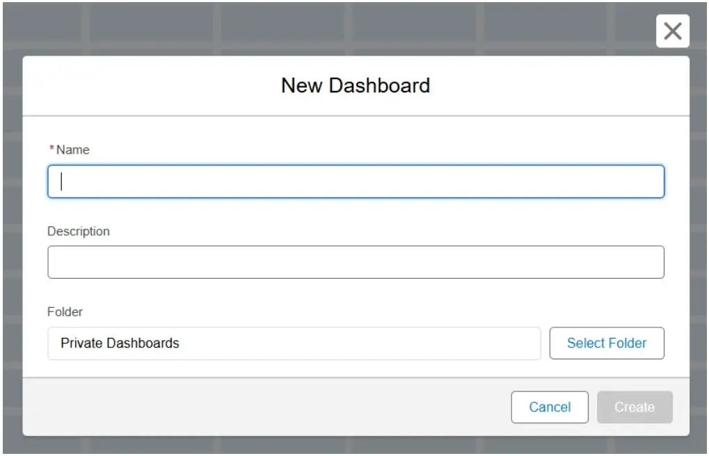
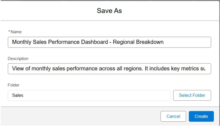
Step 2: Define Dashboard Properties
- Enter a name and description for your dashboard.
- Select the folder where it will be saved and set appropriate sharing settings.
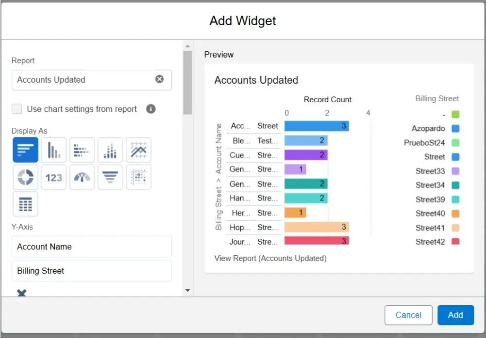
Step 3: Add Components
- Click + Widget and choose the report you want to visualize.
- Select a chart type, such as bar, pie, or line.
- Adjust settings to match your desired layout and data presentation.
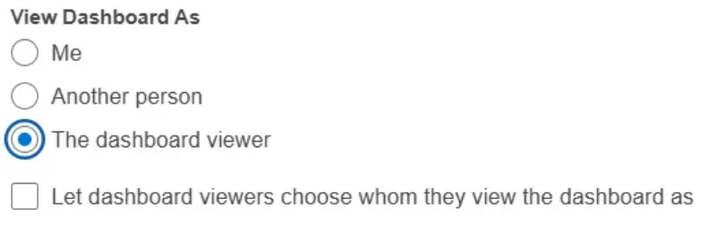
Step 4: Set the Running User
- Choose “The dashboard viewer” as the running user to make the dashboard dynamic.
- This ensures the dashboard adapts based on the viewer’s role and permissions.
Step 5: Save and Test
- Save your dashboard and test it by logging in as different users.
- Verify that each user sees personalized data.
Step 6: Optimize Layout and Components
- Organize components logically to ensure data flows intuitively.
- Use descriptive titles and labels to improve clarity.
Master Dynamic Dashboards: 5 Steps to Boost Performance in Salesforce
1. Define Objectives and KPIs
Why it’s useful: Defining objectives ensures that users only see relevant information, helping them focus on insights that matter.
For example, by defining “Opportunity Conversion Rate” as a KPI, the dashboard can highlight the percentage of leads converted to opportunities in a prominent widget. Sales managers can now instantly see whether their team is on track to hit their targets.
2. Optimize Dashboard Design
Why it’s useful: A well-organized layout helps users quickly find the insights they need without getting overwhelmed.
For example, a dashboard streamlined with different key charts. The most critical metrics (e.g., sales performance, top regions) are placed at the top. Using clear color schemes (e.g., green for growth, red for underperformance) can guide the user’s attention to areas needing action.
3. Leverage Cross-Filtering
Why it’s useful: Cross-filtering allows users to interact with the dashboard, digging deeper into areas of interest without creating new reports.
For example, if a user has to create multiple reports to analyze sales performance by region or product, this is time-consuming and limits flexibility. With cross-filtering enabled, clicking on “North America” in a global sales chart dynamically updates all other widgets (e.g., product performance, customer satisfaction) to display data specific to that region.
4. Regularly Update Reports
Why it’s useful: Up-to-date data is critical for decision-making. Stale or inaccurate data destroys trust and leads to misinformed actions.
If reports feeding the dashboard haven’t been updated in weeks, it may lead to discrepancies between actual performance and what the dashboard shows.
If reports are scheduled to refresh daily, it ensures the dashboard displays the latest metrics. For instance, a “Revenue” chart could reflect the newest opportunities closed overnight.
5. Monitor Performance
Why it’s useful: Tracking dashboard performance and usage helps identify what’s working and where improvements are needed.
For example, Salesforce’s built-in analytics tools can reveal that the “Regional Sales Breakdown” chart is the most viewed widget, while “Weekly Activity Log” is rarely accessed. This insight prompts removing or improving underutilized components, simplifying the dashboard.
Advanced Features and Tips
Dynamic Dashboards in Lightning Experience
Take advantage of Lightning’s enhanced user interface for better performance and visualization. Features like drag-and-drop components and responsive layouts make dashboard creation faster and more flexible.
Cross-Filtering Across Components
Use cross-filtering to create interactive dashboards that reveal deeper insights. For example, filter sales performance by product line directly from the dashboard.
Key Takeaways
- Dynamic dashboards provide personalized, real-time insights tailored to user roles.
- They improve collaboration, security, and efficiency.
- Organizations can optimize performance by defining objectives, leveraging advanced features, and maintaining up-to-date data.
- Dynamic dashboards reduce maintenance effort by consolidating multiple dashboards into a single, adaptable solution.
Dynamic dashboards enable businesses to maximize their Salesforce investment by providing actionable insights and improving decision-making. By leveraging tools like Xappex’s XL-Connector 365, you can further streamline reporting and data management for optimal results.
FAQ
Can we refresh the dynamic dashboards in Salesforce?
Yes, navigate to your dashboard > click the ‘Refresh’ button on the top right.
Can I schedule a dynamic dashboard in Salesforce?
Yes, navigate to the dashboard section > name of your dashboard > Subscribe > define the frequency, days and time for your schedule > Save.
How to check dynamic dashboard limits in Salesforce?
Check your organization’s limits in Setup > Reports and Dashboards Settings.
How to see how many dynamic dashboards in Salesforce?
Navigate to Setup > Reports and Dashboards Settings to view the number of dynamic dashboards used.
How to identify dynamic dashboards in Salesforce?
Dynamic dashboards can be identified by their “running user” settings, which are configured to adapt to the logged-in user.


Xappex CRM data management solutions

G-Connector for Salesforce
Connect your Salesforce data to Google Sheets in a two-way sync.

XL-Connector for Salesforce
Connect and export your Salesforce data to Excel.

Looker Studio for Salesforce
Connect Salesforce reports and queries to your Google Data Studio dashboards.

Excel Merge
Calculate advanced Excel models. Generate Excel documents based on Salesforce data. All with a single click from a Salesforce record page.

XL-Connector 365
Connect and sync Microsoft Excel on all platforms with Salesforce.