Salesforce Dashboards: The Ultimate Guide

Salesforce dashboards turn your data into visual snapshots to spot trends and make decisions faster. They pull numbers from reports and display them in easy-to-read charts, tables, or gauges—all in a single view.
Whether you’re tracking sales goals, marketing campaigns, or team performance, dashboards help you see what’s working and what’s not.
What Are Dashboards in Salesforce?
Dashboards clearly visualize real-time data, enabling quick and informed decision-making. They consolidate data from single or multiple reports into a unified view, simplifying the process of tracking changing business conditions.
With dashboards, users can identify trends, analyze quantities, and evaluate the impact of their activities. They are essential for monitoring performance, tracking goals, and interpreting data patterns in sales, marketing, or operations.
Dashboard components and widgets
They are composed of various widgets, which you can arrange to present your information effectively. The flexibility of modern Salesforce dashboards allows for more than just charts and tables.
There are now three types of widgets you can add to enhance the functionality of your dashboards:
Charts
Charts allow you to present data graphically, making trends and comparisons clear. Salesforce CRM offers multiple chart options such as bar, pie, line, and donut charts.
Example: Use a pie chart to display the distribution of opportunities across stages or a bar chart to compare monthly sales performance.
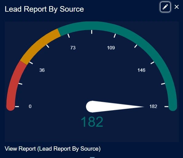
Gauges
Gauges help you display a single value within a range to show progress toward a goal.
Key Features:
- Set ranges with custom colors (e.g., red for poor, yellow for acceptable, green for good).
- Define minimum, breakpoint, and maximum values.
- Optionally, show totals or percentages.
- Example: Use a gauge to track monthly revenue and measure progress toward your targets.
Metrics
Metrics highlight a single value that’s important to your business.
Example: Display the total closed opportunities for a month or the number of new leads generated.
Tables
Tables are great for displaying detailed data in rows and columns.
Key Features:
- Customize fields such as opportunity name, amount, or close date.
- Apply sorting and conditional highlighting.
- Limit rows for better focus (e.g., top 10 deals).
- Example: Create a table to show the top 20 deals sorted by revenue, including relevant details like sales reps or close dates.
Visualforce Pages
Visualforce pages let you build custom components for unique requirements or integrations. These can include external system data or customized views of Salesforce data.
They are only available in Salesforce Classic and require specific configurations to display properly in dashboards.
Example: Use a Visualforce page to show real-time inventory data from an external system.
Custom S-Controls
Custom s-controls allow embedding content such as HTML forms or Java applets. However, Salesforce no longer supports creating new s-controls, favoring Visualforce pages.
Rich Text
You can add instructional text, hyperlinks, or guidance that provides context about the dashboard or specific components. This is useful for clarifying the dashboard’s purpose or guiding users through its features.
Images
Adding images makes customization easy. For instance, incorporating your company’s logo can help personalize and align the dashboard with your branding.
Dashboard Types
Standard Dashboard:
It displays the same data to all users but is still subject to the user’s profile and permissions. If users don’t have access to specific records or objects in Salesforce, they won’t be able to view the associated data in the dashboard or reports. Static Dashboards are the default type in Salesforce.
Dynamic dashboard:
Dynamic Dashboards adjust based on the viewer’s permissions, offering a personalized view. For instance, if users can only view their own Opportunities, a Dynamic Dashboard can be configured to show them all Opportunities, regardless of their access restrictions in Salesforce.
For a detailed overview of Dynamic dashboard, check out our article
Dashboard limits:
- In Salesforce Classic, dashboards can include up to 25 components: 20 charts or tables, three images, and 25 rich text widgets.
- Dashboard components can process up to 1,000 groupings. Aggregated totals only account for the values within the first 1,000 groupings.
- Tables and charts can display up to 20 images.
- Downloaded or shared images of dashboard widget tables are capped at a height of 3,000 pixels or approximately 100 rows. Rows beyond this limit are clipped. To avoid this, apply filters to reduce the row count.
- Allow at least 1 minute between dashboard refreshes to avoid performance issues.
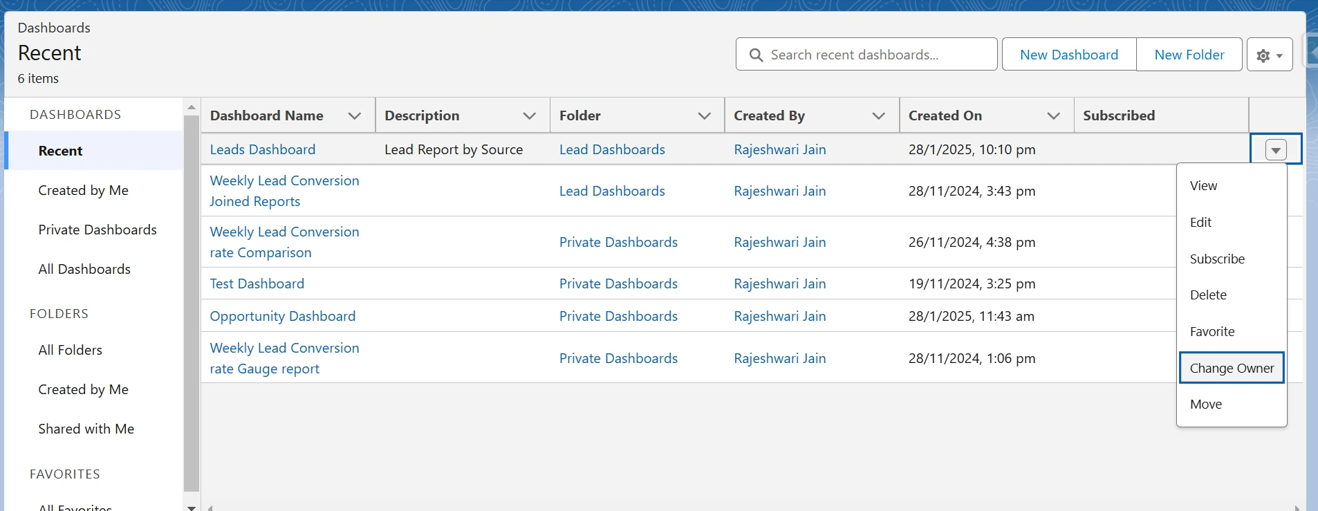
- You can change the ownership of up to 50 dashboards at a time.
You can learn more about the limits in the official Salesforce documentation.
Dashboard Permissions
To open or run a report or dashboard, users must:
- Have Folder Access: Permissions to the folder where the report or dashboard is saved.
- Have User Permissions: For example, “Run Reports” permission to view or execute a report.
- Additional Access: This is required for reports or dashboards linked to Data Cloud.
Private and public folders
To share these already created reports or dashboards with others, you share the folder in which they are stored, not the individual report or dashboard.
By default, when you save a report or dashboard, it goes into your private folder. To make it accessible to others, save it to a public or custom folder by selecting the appropriate option in the “Save” dialog box.
- Private Folders: Only you can view the content saved in your private folder.
- Public or Custom Folders: These allow other users with the necessary permissions to access the reports and dashboards.
In Salesforce, folder names differ slightly between Classic and Lightning Experience, but their functions remain the same. Here’s how the names correspond:
- Unfiled Public Reports (Salesforce Classic) → Public Reports (Lightning Experience)
- My Personal Custom Reports (Salesforce Classic) → Private Reports (Lightning Experience)
- My Personal Dashboards (Salesforce Classic) → Private Dashboards (Lightning Experience)
To understand folders better, explore the official Salesforce documentation
How to Create a Dashboard in Salesforce?
Build a Report
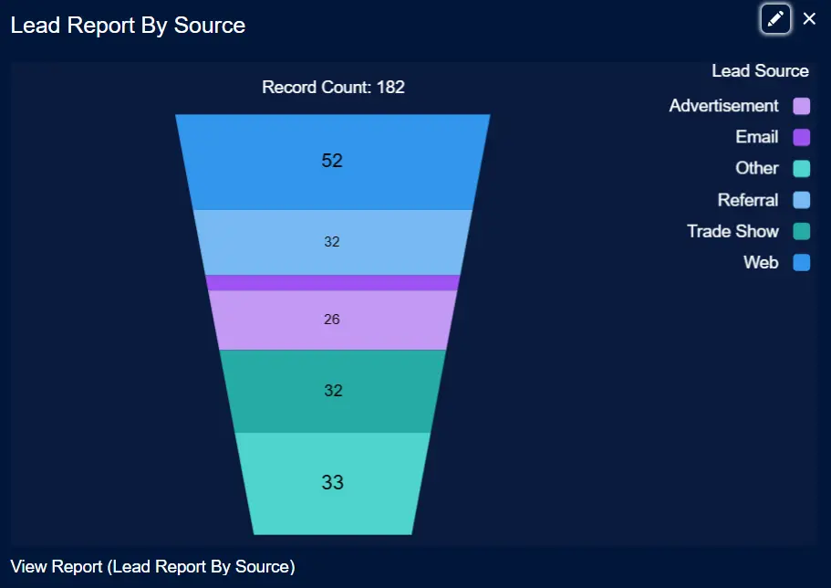
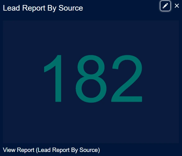
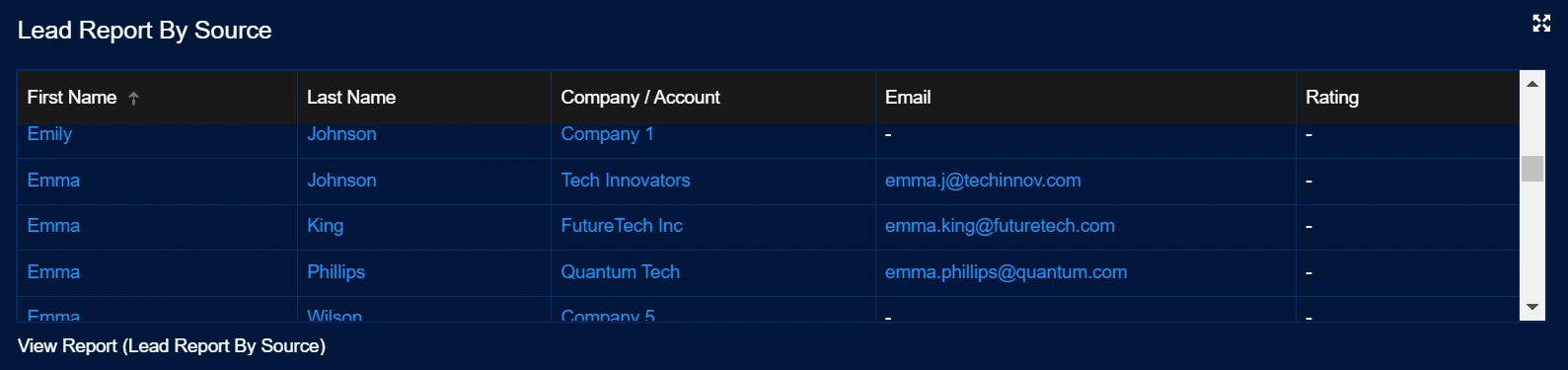
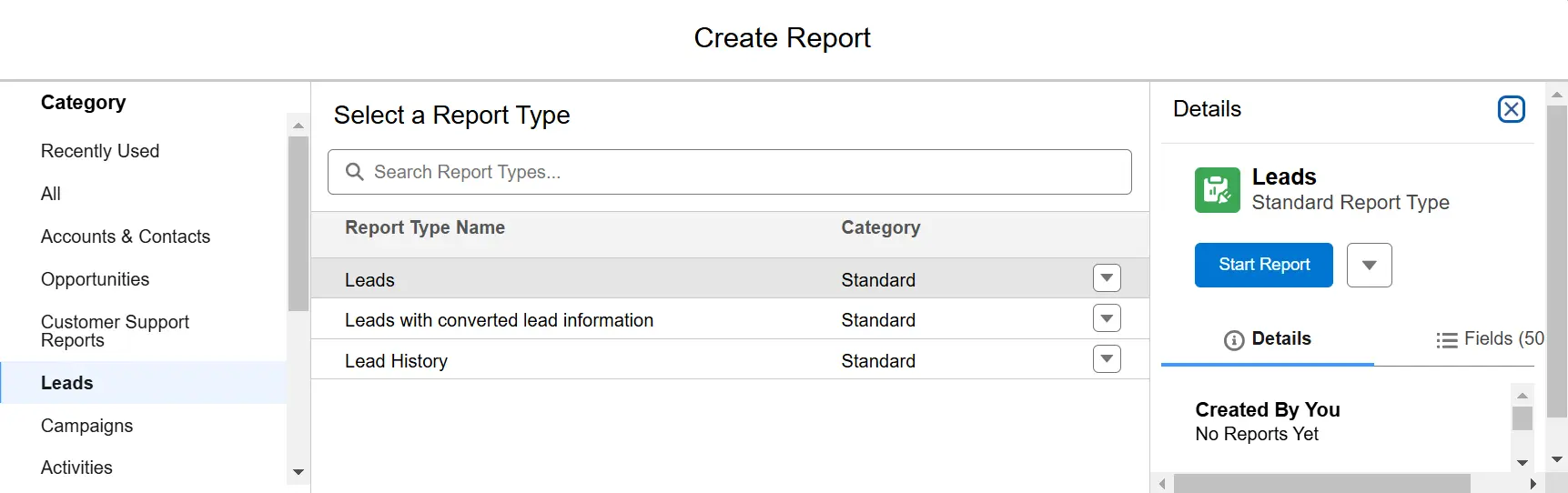
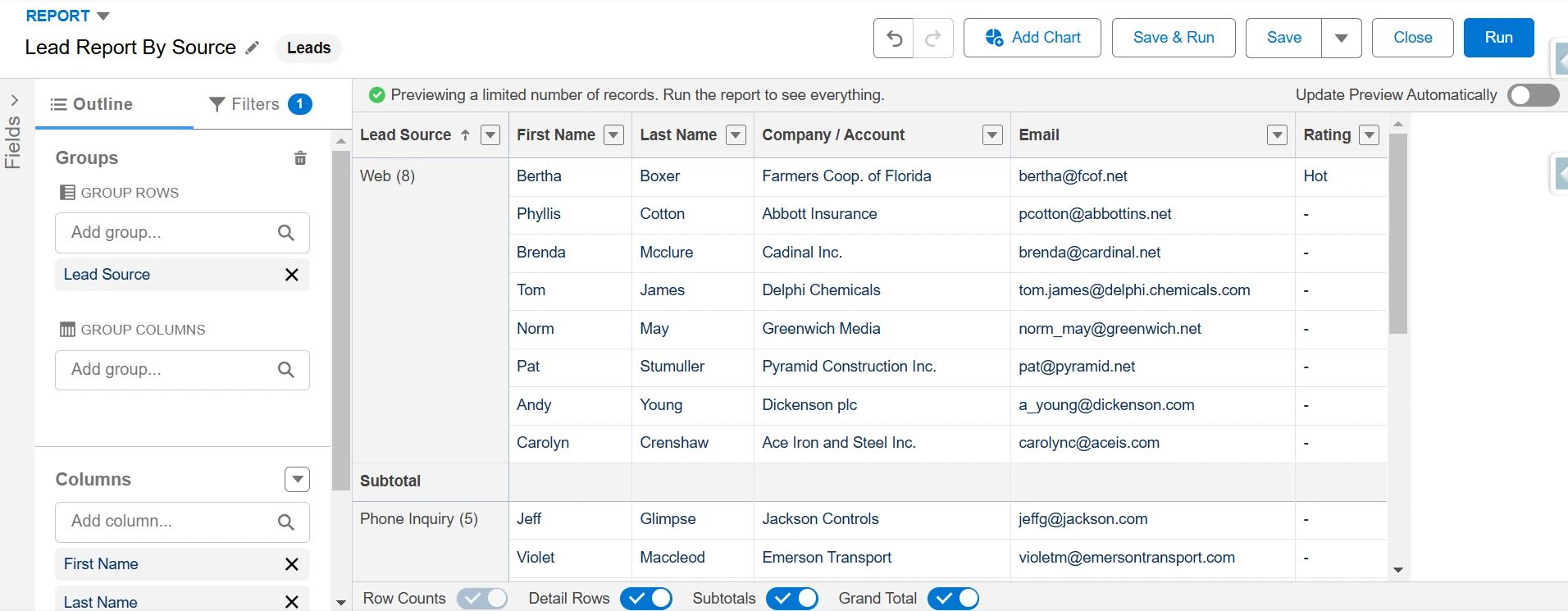
To create a source report for your dashboard, click the Reports tab and select New Report. Choose Leads as the report type and click Start Report.
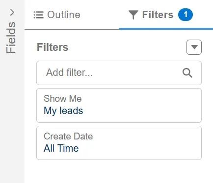
Apply filters by setting the Show Me filter to All Leads and the Date Field to Create Date with All Time as a range.
Group rows by Lead Source and include key fields such as First name, Last name, Company, Email, and Rating. Finally, save the report as Leads Report By Lead Source and click Run to preview the data.
Create a Dashboard:
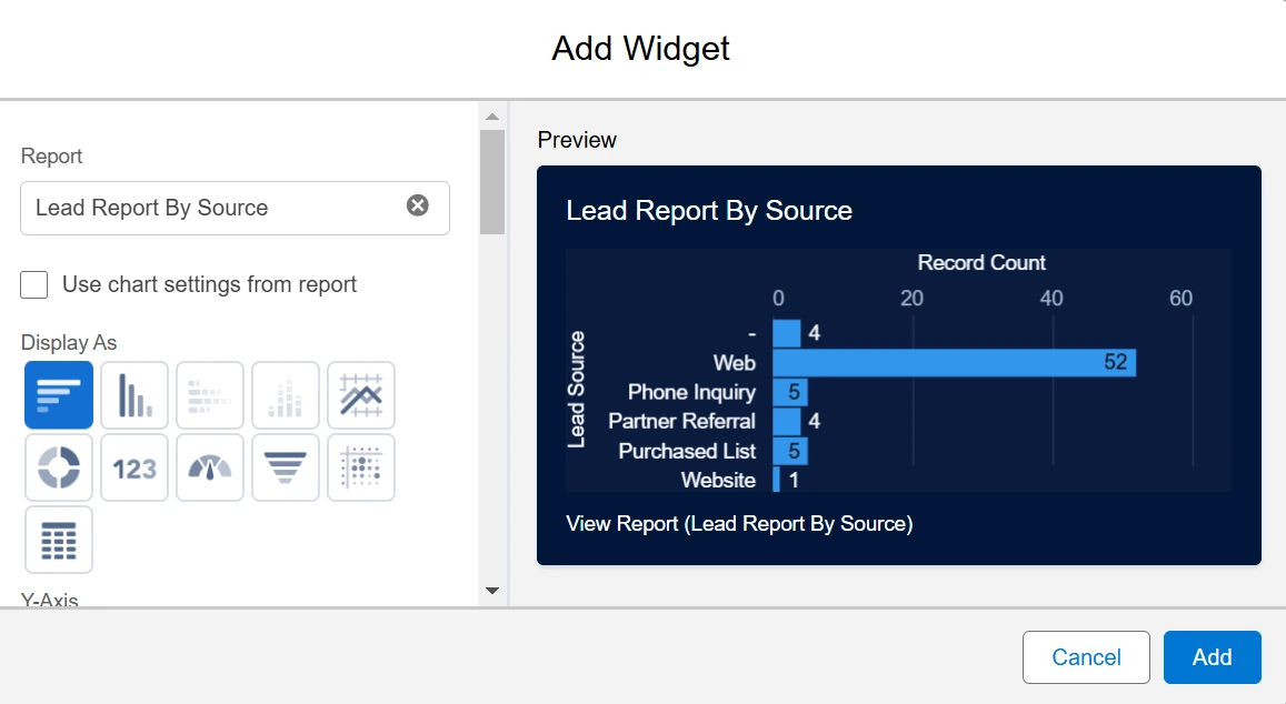
To create a dashboard, access the Dashboard Builder from the Dashboards tab and click New Dashboard. Provide a name, such as Leads Dashboard, and optionally add a description.
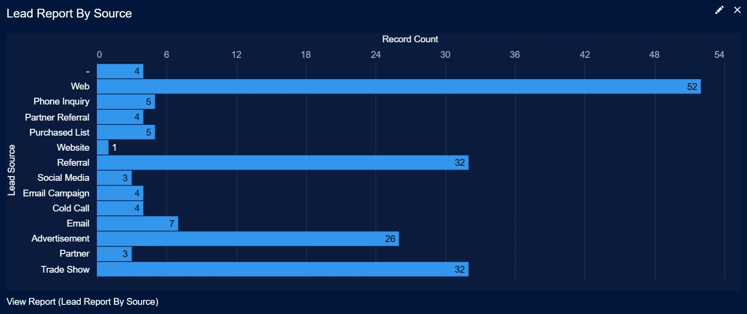
Click + Widget to insert a component, selecting the Leads by Lead Source report as the data source. Choose a visualization type, like a Donut Chart, to display lead distribution. Customize the Widget by adding a title, subtitle, or footer, and adjust its size and position.
Finally, click Save, then Done to complete your dashboard.
Sharing Dashboards in Salesforce
To enable team collaboration, you can share dashboard folders in Salesforce using enhanced folder sharing. It allows you to control access by specifying users, roles, groups, or territories.
To Share Dashboards in Salesforce:
Go to the Dashboards tab and select a folder view from the left panel. Locate the desired folder and click the Folder Actions Menu icon next to the folder name.
Select Share from the menu.
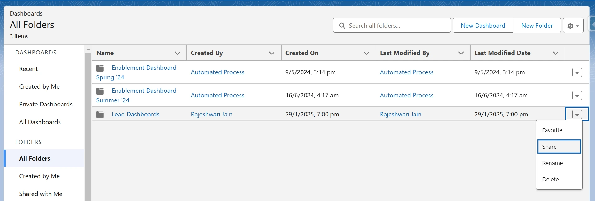
In the Share With dropdown, select the recipient type: User, Group, Role, or Territory. Enter the name corresponding to the selected category.
For example, if you choose User, specify the user name you want to share with.
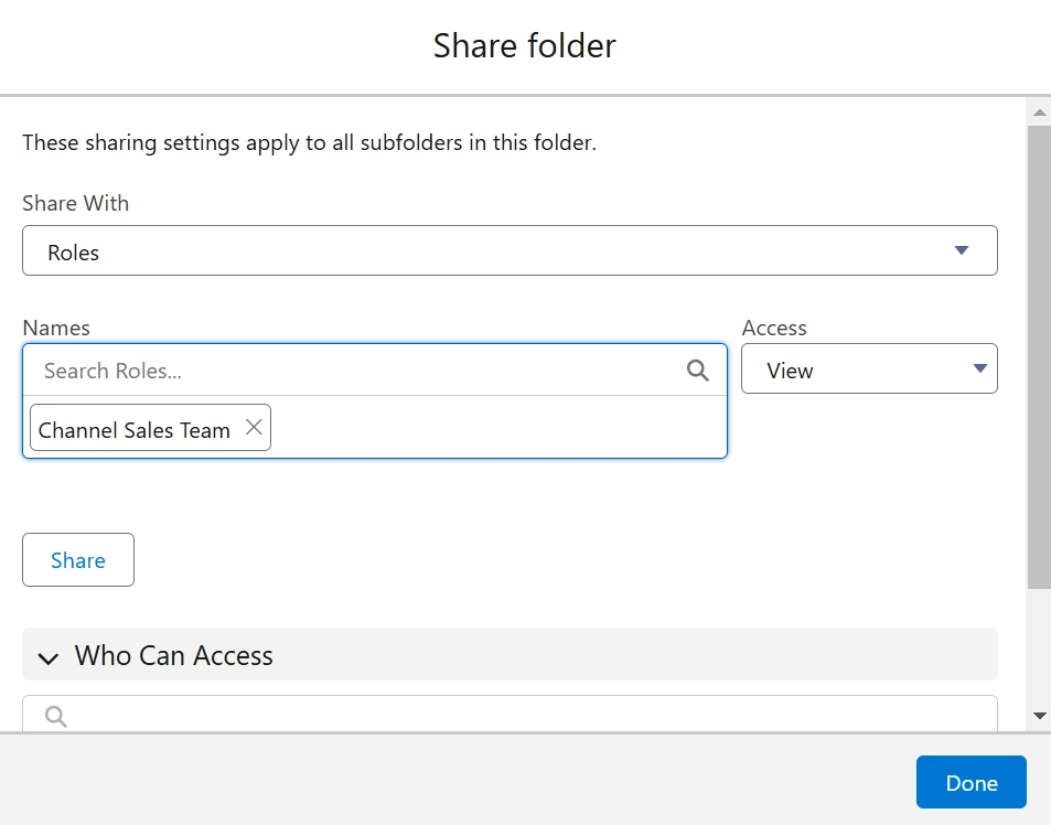
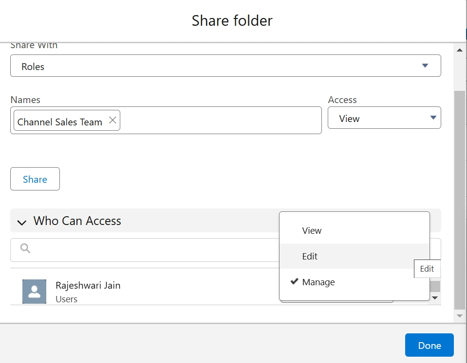
Assign an appropriate access level for each recipient:
- View: Allows viewing the dashboards.
- Edit: Allows viewing and editing the dashboards.
- Manage: Grants complete control, including editing and sharing permissions.
Once all recipients and permissions are set, close the sharing dialog box.
Your dashboard folder is now shared, allowing your team or stakeholders to access it based on the permissions you’ve granted.
Sharing Limits
- Share up to 25 users, groups, roles, or territories directly via the Salesforce UI.
- For broader sharing (up to 500 entities), leverage the folder sharing REST API.
Changing Dashboard Ownership in Salesforce
In Salesforce, you can change a dashboard’s owner, even if the current owner is deactivated. The new owner will have edit access to the dashboard folder and become the running user if the current user is inactive.
Salesforce dashboards give a high-level overview, but spreadsheets allow for more detailed analysis. While Salesforce licenses are required for regular users, spreadsheets make sharing data with non-licensed users easy.
With XL-Connector 365, you can pull Salesforce data into spreadsheets and schedule automatic report updates. Charts and pivot tables in Excel refresh when reports are updated, and custom formulas help you customize the data to meet your business needs.
Dashboard examples
Sales Performance Dashboard
A Sales Performance Dashboard provides a clear view of sales metrics, helping teams track progress and improve outcomes. It identifies trends, highlights top performers, and pinpoints areas needing improvement.
Salesforce’s real-time updates and collaborative tools help sales teams align efforts, adapt to changes, and achieve better results.
Key Metrics to Track
- Monitor Total Revenue per Quarter to measure your organization’s financial performance. Analyzing quarterly revenue helps identify growth opportunities and address challenges.
- Track Win Rates and Closed Deals to evaluate sales effectiveness. This metric shows the percentage of deals won and helps improve sales strategies.
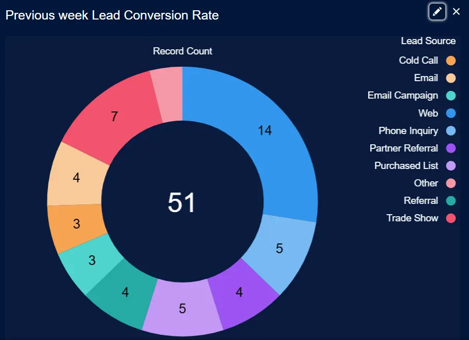
- Measure Lead Conversion Rate to assess how efficiently leads turn into opportunities. This will reflect the effectiveness of your lead management processes and highlight areas for improvement.
Example:
Use the dashboard to track weekly changes in metrics such as lead conversions or sales. For instance, if lead conversions decline, adjust follow-up strategies promptly. Early detection of trends, such as seasonal fluctuations, supports proactive planning and corrective actions.
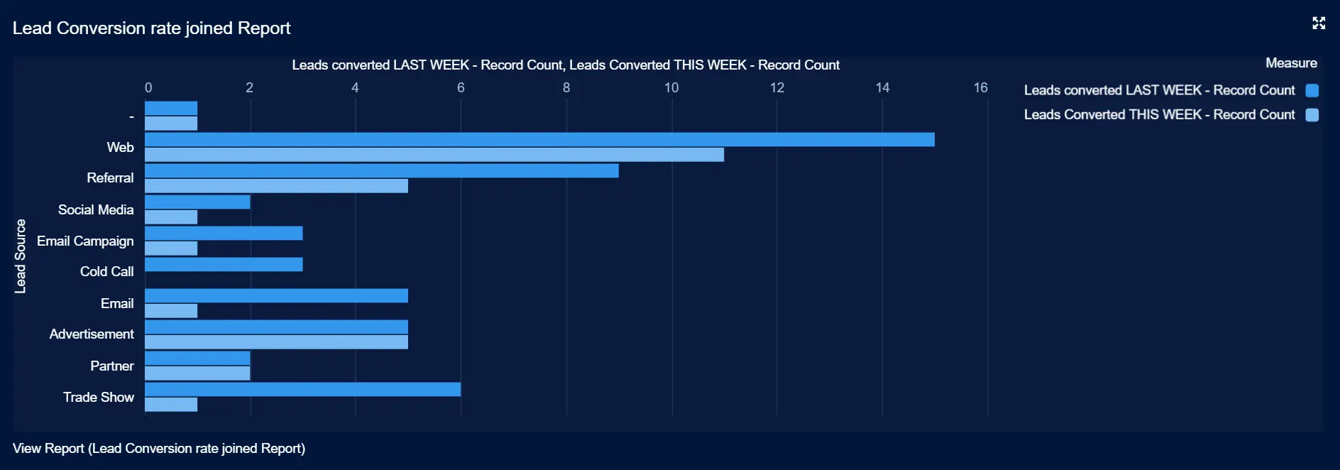
For a quick guide, please refer to: Understanding Week Over Week Changes in Salesforce Dashboards
Opportunities by Stage for Sales Pipeline
Every opportunity in Salesforce moves through defined stages, such as Prospecting, Qualification, Proposal, and Closed. These stages represent where a deal stands in the sales process.
Displaying opportunities by stage on your dashboard makes it easier to:
- Understand Pipeline Health: See how opportunities are spread across stages to spot bottlenecks or gaps.
- Improve Forecasting: Estimate revenue by focusing on deals in advanced stages.
- Track Team Performance: Measure the number and value of deals in each stage to understand how the team performs.
Example:
Say a sales manager is preparing for a team meeting. By checking the “Opportunities by Stage” chart, they can identify where deals are stuck and offer advice to move them forward. They can also prioritize high-value deals close to closing, ensuring the team focuses on the most impactful opportunities.
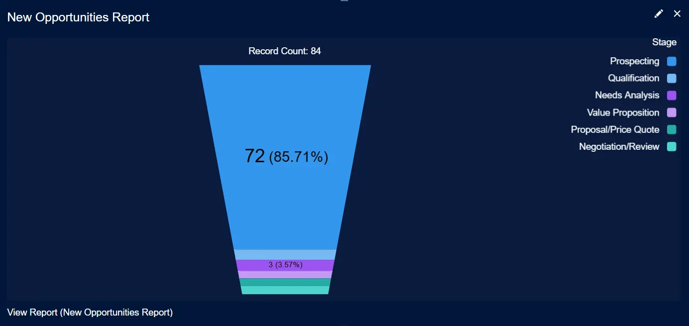
To know more, please refer: How to Create a Report on Opportunities by Stage
Conclusion
Salesforce dashboards make tracking what’s happening in your business right now easier. Whether you’re watching sales numbers, checking progress toward goals, or sharing updates with your team, dashboards cut through the noise by focusing on key metrics.
They adapt to fit your needs with options to customize charts or tables and add your company’s branding. Start building your dashboards today to save time, keep everyone aligned, and turn raw data into clear next steps.
FAQ
What is the difference between dashboards and reports in Salesforce?
Dashboards summarize data from reports, showing key metrics visually. Reports focus on detailed data, allowing filtering, grouping, and analysis. Dashboards provide high-level overviews, while reports focus on specifics.
How many dashboards can I create in Salesforce?
Salesforce doesn’t impose a strict limit on the total number of dashboards you can create, but there are some constraints to remember.
For dynamic dashboards, you can create up to 5 dynamic dashboards for the Enterprise Edition, 10 for the Unlimited and Performance Editions, and 3 for the Developer Edition.
What is the difference between a dashboard and a dynamic dashboard in Salesforce?
Static Dashboards show the same data to everyone but respect user permissions—if a user can’t access certain records, they won’t see them here. These serve as the default dashboards in Salesforce.
Dynamic Dashboards personalize data based on who’s viewing them. For example, a sales rep restricted to their own Leads could still see all Leads in a dynamic dashboard, overriding their usual access limits.
Which Salesforce license provides access to dashboards?
In Salesforce, access to dashboards is primarily determined by the user’s license type and permissions. Users with Salesforce Platform, Lightning Platform (One App), and Force.com (App Subscription) licenses have access to dashboards.
Users need “Run Reports” and “View Dashboards” permissions to access dashboards.
How to clone a Salesforce dashboard?
To copy a dashboard in Salesforce, open it, click the down arrow next to the “Subscribe” button, and select “Save As.” Enter a new name and choose a folder.
Click “Create” to finish. The new report or dashboard will appear with the updated name.

Xappex CRM data management solutions

G-Connector for Salesforce
Connect your Salesforce data to Google Sheets in a two-way sync.

XL-Connector for Salesforce
Connect and export your Salesforce data to Excel.

Looker Studio for Salesforce
Connect Salesforce reports and queries to your Google Data Studio dashboards.

Excel Merge
Calculate advanced Excel models. Generate Excel documents based on Salesforce data. All with a single click from a Salesforce record page.

XL-Connector 365
Connect and sync Microsoft Excel on all platforms with Salesforce.