Understanding Week Over Week Changes in Salesforce Dashboards
Tracking week-over-week changes in Salesforce allows businesses to monitor performance and identify trends by comparing key metrics from one week to the next. This helps measure progress and make informed decisions.
What are week over week changes in Salesforce?
Week-over-week changes compare metrics like sales, lead conversions, or customer interactions from one week to the next. Tracking these changes provides a clear view of performance and helps address issues promptly. For example, a drop in lead conversions can prompt immediate adjustments to follow-up processes.
This approach also highlights trends, such as seasonal patterns or recurring dips, enabling better planning and timely action. Regular monitoring improves team performance through quick feedback and real-time problem-solving.
It also supports informed decisions by providing fresh, actionable data, ensuring your business stays aligned with its goals.
How do we Track Week Over Week Changes in Salesforce Dashboards?
Start by deciding which metric to track. For this example, focus on the number of leads converted across different lead sources to evaluate sales performance. Selecting the right dashboard metrics is crucial to measuring what matters most for your analysis.
Step 1: Create a Joined Salesforce Report
To create a joined report for tracking week-over-week changes, go to the Reports tab, click “New Report,” and select “Leads with Activities” as the report type.
Next, click Add Block to include two report blocks. In the first block, apply the following filters: set Show Me to All Leads, Last Activity to All Time, and Converted Date to Last Week to capture leads converted the previous week.
In the second block, apply similar filters but set the Converted Date to This Week to capture leads converted this week.
Finally, the data will be grouped across both blocks by Lead Source.
Step 2: Add Chart
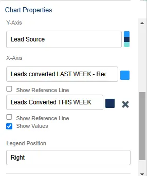
Once you’ve created the joined report, add a chart to help visualize the data. Click “Add Chart,” select either a Bar or Line Chart, and set Lead Source as the y-axis and Leads Converted-Record Count as the x-axis.
Include both blocks to compare this week’s and last week’s data, highlighting trends and changes.
Step 3: Add Report to your Dashboard
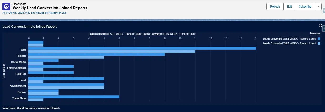
Once your report is ready, navigate to the Dashboards tab and create a new dashboard or update an existing one.
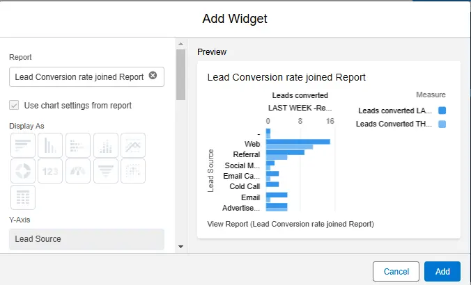
Click on “Add Widget,” choose “Chart or Table,” and select the joined report you created. Ensure the “Use Chart Settings from Report” option is checked, pick a suitable theme, and click “Add” to finish.
For a more advanced approach to tracking historical Salesforce data, G-Connector for Salesforce offers an easy way to create automated data snapshots in Google Sheets. It allows users to schedule snapshots, customize timestamp formats, and store data in Google Drive for easy retrieval.
With automated scheduling, flexible storage options, and a simple setup, G-Connector streamlines historical data tracking, making it easier to analyze trends.
Learn more in Salesforce Snapshot Reporting made easy
Conclusion
Monitoring weekly changes in Salesforce dashboards helps track your business’s progress. By comparing data, you can quickly do trend analysis, address issues, and adjust strategies. This approach supports data-driven decisions and helps achieve business goals.
Start a 14-day free trial of G-Connector and see an immediate boost in your data management!

Xappex CRM data management solutions

Looker Studio for Salesforce
Connect Salesforce reports and queries to your Google Data Studio dashboards.

Excel Merge
Calculate advanced Excel models. Generate Excel documents based on Salesforce data. All with a single click from a Salesforce record page.
